SPOTLIGHTS

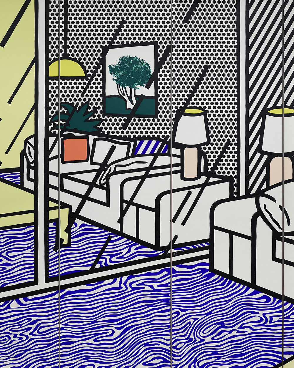
Roy Lichtenstein | Tapete mit Interieur mit blauem Fußboden, 1992 | ALBERTINA, Wien © Estate of Roy Lichtenstein/Bildrecht, Wien 2024 | Foto: ALBERTINA, Wien

Modern exhibition concepts pay particular attention to the communication of art. In order to present art to a broad public in a way that is both exciting and easily accessible, a new tool is being added to the exhibition: the new concept SPOTLIGHT makes it possible to show the diversity of the constantly growing collection by means of individual, self-contained themes. The centuries-long dialogue between different artists can be explored in greater depth through cross-referencing. This results in new perspectives and references in a wider art historical and social context.

SPOTLIGHT VALIE EXPORT

VALIE EXPORT numbers among the most important media and performance artists internationally. Born in 1940 in Linz, she attended the arts and crafts school there before moving to Vienna in 1960. Following graduation from the Higher Federal Technical Institute for Education and Experimentation for the Textile Industry, she began realizing her initial performative works in 1967. The context in which these arose was that of Viennese Actionism, which broke down painting’s classical genre-boundaries and questioned bourgeois norms with radical actions during the 1960s.

The artist formulates her media criticism as explicitly feminist criticism that is inseparably linked with scrutiny of the female body’s representation and of women’s role in a patriarchal society. In doing so, she distances herself in a clear way from the former movement’s expressive pathos. Making reference to her own body, EXPORT uses a multitude of media—such as photography, video, and drawings—to investigate sociopolitical structures that inscribe themselves on the body in a painful way. EXPORT has had to fight hard for her position in the art scene. Art, to her, is not a counterdraft to reality but subversively calls for a new perspective on reality. 1970 saw her point out the absent recognition of female artists by self-confidently taking her artist’s name from the label of the best-known Austrian cigarette brand.

Details

Action Pants: Genital Panic

Action Pants: Genital Panic arose from a scandalous expanded cinema action: during an avant-garde film festival, VALIE EXPORT had stridden through a cinema hall’s rows of seats wearing a pair of crotchless pants. For this later photographic work, the basic idea was to reflect the voyeurism of the audience. It hence shows EXPORT once again wearing a revealing pair of pants but heightens the confrontation via a male-connoted pose and props: with her legs spread wide, a leather jacket, and a machine gun, the artist undermines feminine stereotypes. She then chose one shot that is particularly provocative due to its frontal perspective and the artist’s direct gaze into the camera, had it printed on posters, and fly-posted these in public locations. It is thus that EXPORT, in an actionistic as well as media-reflexive gesture, expands her audience from that of the closed cinema hall to encompass all potential viewers in the public realm.

I beat it

Valie EXPORT’s 1980 installation I beat it had its roots in one of her actions. This action adhered to a precise score:

Floating in a basin filled with a dark fluid is a life-sized photograph of the artist. Her arms and legs are immobilized by lead shackles. Beside the basin is a cannister, the original container of the fluid.

The barking of German shepherds, which emanates from three monitors, is followed by cries of "More! More!"—coming once from a woman and once from a man—indicating yet another intensification of suffering. The triangle formed by the monitors with the woman floating on its centerline alludes to trinity and nature but also to male ideology. The fact that the artist was immobilized during the original action in 1978 underscores the role of women “as dependent marionettes of the social machinery,” and the ambivalence between calm motionlessness and debasement does indeed remain intact in the installation. In EXPORT’s view, to be immobilized and debased is also to serve as the lubricant of a communication that should be frictionless.

VALIE EXPORT – SMART EXPORT Self-portrait

When she was 27, the artist—whose real name is Waltraud Höllinger (née Lehner)—decided to call herself VALIE EXPORT. Written in upper-case letters and protected by copyright, this brand name serves to liberate her from the last names of her father and of her former husband—an act with which she self-confidently positioned herself as a female artist in an art scene that was dominated by men. The self-representation VALIE EXPORT – SMART EXPORT, immortalized by the freelance amateur photographer Gertraud Wolfschwenger, playfully heightens this theme of self-assertion. With a smoldering cigarette in her mouth and standing in a male-connoted pose, EXPORT holds a Smart Export cigarette pack redesigned as her own brand into the camera—with her own nickname as the brand name and a photo of her face as the logo.

TAPP und TASTKINO

Valie EXPORT’s 1980 installation I beat it had its roots in one of her actions. This action adhered to a precise score:

Floating in a basin filled with a dark fluid is a life-sized photograph of the artist. Her arms and legs are immobilized by lead shackles. Beside the basin is a cannister, the original container of the fluid. 

The barking of German shepherds, which emanates from three monitors, is followed by cries of "More! More!"—coming once from a woman and once from a man—indicating yet another intensification of suffering. The triangle formed by the monitors with the woman floating on its centerline alludes to trinity and nature but also to male ideology. The fact that the artist was immobilized during the original action in 1978 underscores the role of women “as dependent marionettes of the social machinery,” and the ambivalence between calm motionlessness and debasement does indeed remain intact in the installation. In EXPORT’s view, to be immobilized and debased is also to serve as the lubricant of a communication that should be frictionless.

To the exhibition

VALIE EXPORT | Action Pants: Genital Panic, 1969 | Courtesy Gallery Thaddaeus Ropac, London · Paris · Salzburg · Seoul | © VALIE EXPORT, Bildrecht, Vienna 2024 | Photo: © Peter Hassmann, Bildrecht, Vienna 2024
VALIE EXPORT | VALIE EXPORT - SMART EXPORT Self-Portrait, 1970 | ALBERTINA, Wien – The ESSL Collection | © VALIE EXPORT | Bildrecht, Wien 2024 | Photo: © Gertraud Wolfschwenger, Bildrecht, Vienna 2024
VALIE EXPORT | GROPE and TOUCH CINEMA, 1968 | The ALBERTINA Museum, Vienna – The ESSL Collection | © VALIE EXPORT, Bildrecht, Vienna 2024 | Photo: Werner Schulz
1/3

Action Pants: Genital Panic

Action Pants: Genital Panic arose from a scandalous expanded cinema action: during an avant-garde film festival, VALIE EXPORT had stridden through a cinema hall’s rows of seats wearing a pair of crotchless pants. For this later photographic work, the basic idea was to reflect the voyeurism of the audience. It hence shows EXPORT once again wearing a revealing pair of pants but heightens the confrontation via a male-connoted pose and props: with her legs spread wide, a leather jacket, and a machine gun, the artist undermines feminine stereotypes. She then chose one shot that is particularly provocative due to its frontal perspective and the artist’s direct gaze into the camera, had it printed on posters, and fly-posted these in public locations. It is thus that EXPORT, in an actionistic as well as media-reflexive gesture, expands her audience from that of the closed cinema hall to encompass all potential viewers in the public realm.

I beat it

Valie EXPORT’s 1980 installation I beat it had its roots in one of her actions. This action adhered to a precise score:

Floating in a basin filled with a dark fluid is a life-sized photograph of the artist. Her arms and legs are immobilized by lead shackles. Beside the basin is a cannister, the original container of the fluid.

The barking of German shepherds, which emanates from three monitors, is followed by cries of "More! More!"—coming once from a woman and once from a man—indicating yet another intensification of suffering. The triangle formed by the monitors with the woman floating on its centerline alludes to trinity and nature but also to male ideology. The fact that the artist was immobilized during the original action in 1978 underscores the role of women “as dependent marionettes of the social machinery,” and the ambivalence between calm motionlessness and debasement does indeed remain intact in the installation. In EXPORT’s view, to be immobilized and debased is also to serve as the lubricant of a communication that should be frictionless.

VALIE EXPORT – SMART EXPORT Self-portrait

When she was 27, the artist—whose real name is Waltraud Höllinger (née Lehner)—decided to call herself VALIE EXPORT. Written in upper-case letters and protected by copyright, this brand name serves to liberate her from the last names of her father and of her former husband—an act with which she self-confidently positioned herself as a female artist in an art scene that was dominated by men. The self-representation VALIE EXPORT – SMART EXPORT, immortalized by the freelance amateur photographer Gertraud Wolfschwenger, playfully heightens this theme of self-assertion. With a smoldering cigarette in her mouth and standing in a male-connoted pose, EXPORT holds a Smart Export cigarette pack redesigned as her own brand into the camera—with her own nickname as the brand name and a photo of her face as the logo.

TAPP und TASTKINO

Valie EXPORT’s 1980 installation I beat it had its roots in one of her actions. This action adhered to a precise score:

Floating in a basin filled with a dark fluid is a life-sized photograph of the artist. Her arms and legs are immobilized by lead shackles. Beside the basin is a cannister, the original container of the fluid. 

The barking of German shepherds, which emanates from three monitors, is followed by cries of "More! More!"—coming once from a woman and once from a man—indicating yet another intensification of suffering. The triangle formed by the monitors with the woman floating on its centerline alludes to trinity and nature but also to male ideology. The fact that the artist was immobilized during the original action in 1978 underscores the role of women “as dependent marionettes of the social machinery,” and the ambivalence between calm motionlessness and debasement does indeed remain intact in the installation. In EXPORT’s view, to be immobilized and debased is also to serve as the lubricant of a communication that should be frictionless.

Robert Schaberl | ZF aubergine dance with warm rose 4-6 2019 (290x), 2019 | The ALBERTINA Museum, Vienna | © Robert Schaberl | © Photo source: Robert Schaberl
1/3

SPOTLIGHT: The Tondo in Contemporary Art

The circle has always possessed a special, even mystical significance. In the dictionary of the Brothers Grimm, one reads: “That which is round, particularly the circle and the sphere, awakens the impression of something self-contained, finished, complete.” And even in ancient Egypt, the ouroboros—the snake eating its own tail—symbolized the cycle of life, the forever returning. In this light, the circular tondo—whether done as a painting or as a relief—embodies far more than a formal gimmick.

Details

Trends are phenomena that tend to recur, be it in design, in fashion, in music, or in art. And in contemporary art, too, the shape of the circular disc is not at all that rare. This form initially spread from Florence, achieving broader prominence during the late 1400s as an expression of divine 8 harmony: every point on a circle relates its center, a fact that can likewise be understood as a return to the beginning.

Tondi are important especially in Renaissance painting, as part of which they played an increasingly large role between 1450 and 1510. The earliest such classic circular image is La grande Pietà ronde by the Netherlandish artist Johan Maelwael from ca. 1400. Around a century later, during the first decade of the 1500s, Michelangelo created his Doni Tondo—which was to go down in art history as one of his most famous works. Raphael, with his Madonna della Seggiola (also known as the Madonna della Sedia) of 1514, likewise created an important tondo.

The phenomenon of the circular image then disappeared entirely for the next 400 years. It was only during the 1960s, when American artists such as Frank Stella, Sol LeWitt, and Jackson Pollock developed “shaped canvases” with which they sought to overcome the ever-same rectangular panel painting format, that the tondo once again began receiving attention. Today, tondi are experiencing a renewed comeback. Artists in Austria and abroad are now repeatedly choosing this round form, as one can see in numerous examples from the ALBERTINA Museum’s contemporary art holdings.

Rondinone

Beginning in the 1990s, Ugo Rondinone developed a group of works consisting of a multitude of circular paintings, of which this work is one. On a round canvas 270 centimeters in diameter, he used acrylic paint to create seven concentric circles of varying widths and colors. This round shape shines at the viewer as brightly as an illuminated advertisement, with the absence of a narrative or plot reinforcing the colors’ luminous clarity to a massive extent. Rondinone describes his works of this type prosaically as “large-format sprayed paintings of multicolored concentric circles.” The artist derives the title for each one from a number and the date of its creation, painstakingly written out as the day, month, and year.

Philip Taaffe

The spiral form of Philip Taaffe’s work Unit of Direction, which combines painting with elaborate printing processes, is the product of lengthy intellectual endeavor and an exhaustive search through the treasures of his large library. Alongside recalling the most varied forms of ornamentation ranging from the geometric floor mosaics of Ancient Rome and Hellenism to Islamic arabesques and Indian mandalas and on to the Japonisme of the period around 1900, Unit of Direction also features the natural forms of various snail and muscle species concealed behind the spiral’s inexorable pull.

Robert Schaberl

Robert Schaberl’s concentric abstractions, which he executes in various chromatic gradients and with surfaces ranging from matte to glossy, arise from the overlapping of up to 70 layers of paint on a horizontally rotating support. They trace their roots back to his early photographic experiments with everyday objects such as glasses and biomorphic circular shapes such as those of mushrooms, at first glance suggesting formal comparisons with works of concrete art as well as with the cryptic circular works of Hermann J. Painitz and the Targets by Jasper Johns. Schaberl's aesthetic of the round, 9 however, consists above all in sensory overwhelm, in a schooling of sensitivity, in an attempt to have light appear in its scintillating quality.

To the exhibition

Trends are phenomena that tend to recur, be it in design, in fashion, in music, or in art. And in contemporary art, too, the shape of the circular disc is not at all that rare. This form initially spread from Florence, achieving broader prominence during the late 1400s as an expression of divine 8 harmony: every point on a circle relates its center, a fact that can likewise be understood as a return to the beginning.

Tondi are important especially in Renaissance painting, as part of which they played an increasingly large role between 1450 and 1510. The earliest such classic circular image is La grande Pietà ronde by the Netherlandish artist Johan Maelwael from ca. 1400. Around a century later, during the first decade of the 1500s, Michelangelo created his Doni Tondo—which was to go down in art history as one of his most famous works. Raphael, with his Madonna della Seggiola (also known as the Madonna della Sedia) of 1514, likewise created an important tondo.

The phenomenon of the circular image then disappeared entirely for the next 400 years. It was only during the 1960s, when American artists such as Frank Stella, Sol LeWitt, and Jackson Pollock developed “shaped canvases” with which they sought to overcome the ever-same rectangular panel painting format, that the tondo once again began receiving attention. Today, tondi are experiencing a renewed comeback. Artists in Austria and abroad are now repeatedly choosing this round form, as one can see in numerous examples from the ALBERTINA Museum’s contemporary art holdings.

Rondinone

Beginning in the 1990s, Ugo Rondinone developed a group of works consisting of a multitude of circular paintings, of which this work is one. On a round canvas 270 centimeters in diameter, he used acrylic paint to create seven concentric circles of varying widths and colors. This round shape shines at the viewer as brightly as an illuminated advertisement, with the absence of a narrative or plot reinforcing the colors’ luminous clarity to a massive extent. Rondinone describes his works of this type prosaically as “large-format sprayed paintings of multicolored concentric circles.” The artist derives the title for each one from a number and the date of its creation, painstakingly written out as the day, month, and year.

Philip Taaffe

The spiral form of Philip Taaffe’s work Unit of Direction, which combines painting with elaborate printing processes, is the product of lengthy intellectual endeavor and an exhaustive search through the treasures of his large library. Alongside recalling the most varied forms of ornamentation ranging from the geometric floor mosaics of Ancient Rome and Hellenism to Islamic arabesques and Indian mandalas and on to the Japonisme of the period around 1900, Unit of Direction also features the natural forms of various snail and muscle species concealed behind the spiral’s inexorable pull.

Robert Schaberl

Robert Schaberl’s concentric abstractions, which he executes in various chromatic gradients and with surfaces ranging from matte to glossy, arise from the overlapping of up to 70 layers of paint on a horizontally rotating support. They trace their roots back to his early photographic experiments with everyday objects such as glasses and biomorphic circular shapes such as those of mushrooms, at first glance suggesting formal comparisons with works of concrete art as well as with the cryptic circular works of Hermann J. Painitz and the Targets by Jasper Johns. Schaberl's aesthetic of the round, 9 however, consists above all in sensory overwhelm, in a schooling of sensitivity, in an attempt to have light appear in its scintillating quality.

Blickpunkt Marie Jo Lafontaine

Tears of Steel

27 monitors in a pyramidal arrangement form the projection surface for this filmic enactment of a cult of the body. In close-up shots, the camera’s lens glides across handsome, athletic male bodies. Central to this installation is the idealization of the trained and training body that, as a muscle-machine, makes a hard and aggressive impression.

Details

It was at a New York fitness studio during the mid-1980s that the Belgian artist Marie-Jo Lafontaine became acquainted with “power training,” a form of high-intensity muscular training that takes its practitioners to the edge of their pain tolerance. Repeatedly overcoming this limit both mentally and physically is said to increase strength and muscle circumference. During the mid-1980s, Lafontaine took a strong interest in sustained physical and psychological self-conquest and the attendant highly erotically charged aesthetics. Having discovered a power training club in Marseille, the artist cast several individuals who trained there for her video Les larmes d’acier, which she conceived in light of her impressions from New York. In contrast to the asexuality of classic bodybuilding, the power training scene at that time tended to feature a hint of the homoerotic and sadomasochistic. On her 27 monitors, Lafontaine puts a hyper-masculine stereotype on display that was particularly en vogue during the era in which this work was created: men are warriors, hard and unforgiving—including towards themselves.

In addition to being a contradiction in terms, the title Les larmes d’acier [Tears of Steel] is also a historical reference: during World War II, Belgians used this term to refer to the bombs rained down on them by Germany’s Luftwaffe. And the entire installation—its film sequences and music—juxtaposes contradictory things: body and machine, lust and suffering, sensuality and death.

To the exhibition

1/1

It was at a New York fitness studio during the mid-1980s that the Belgian artist Marie-Jo Lafontaine became acquainted with “power training,” a form of high-intensity muscular training that takes its practitioners to the edge of their pain tolerance. Repeatedly overcoming this limit both mentally and physically is said to increase strength and muscle circumference. During the mid-1980s, Lafontaine took a strong interest in sustained physical and psychological self-conquest and the attendant highly erotically charged aesthetics. Having discovered a power training club in Marseille, the artist cast several individuals who trained there for her video Les larmes d’acier, which she conceived in light of her impressions from New York. In contrast to the asexuality of classic bodybuilding, the power training scene at that time tended to feature a hint of the homoerotic and sadomasochistic. On her 27 monitors, Lafontaine puts a hyper-masculine stereotype on display that was particularly en vogue during the era in which this work was created: men are warriors, hard and unforgiving—including towards themselves.

In addition to being a contradiction in terms, the title Les larmes d’acier [Tears of Steel] is also a historical reference: during World War II, Belgians used this term to refer to the bombs rained down on them by Germany’s Luftwaffe. And the entire installation—its film sequences and music—juxtaposes contradictory things: body and machine, lust and suffering, sensuality and death.

Friedensreich Hundertwasser | 313 Du soleil pour ceux qui pleurent en campagne, 1957 / 1959 | ALBERTINA, Wien – The ESSL Collection
1/1

Blickpunkt Friedensreich Hundertwasser

Fritz Stowasser – der sich, seit 1949 Friedensreich Hundertwasser nennt – ist ab den 1950er-Jahren Teil einer sich in Paris formierenden Avantgarde: zugleich ein Außenseiter, eigenständig und einzigartig in Bildfindung und Farbwahl. Mit seinem ausgeprägten persönlichen Stil ist sein Œuvre keiner Stilrichtung zuzuordnen.

Inspiriert durch die Ornamente und dekorativen Elemente Gustav Klimts, Egon Schieles und Paul Klees, schafft er sich eine eigene, oft mit chiffrierten Bedeutungen verbundene Motivwelt. Er knüpft an die Tradition des österreichischen Jugendstils an: In dessen stilisierten Wellenmustern sieht er die Idee natürlichen Wachstums versinnbildlicht. In der Auseinandersetzung mit der Natur und allem Organischen findet er zu einer Malerei, die Landschaftsformationen auf abstrakte Linien, Spiralen und Tropfenformen reduziert.

Details

Das zentrale Symbol seiner farbintensiven Bildwelt ist die Spirale – 1953 entsteht die erste. In diesem Jahr sieht Hundertwasser einen Kurzfilm über die Kunst von Psychiatriepatienten. Das Bild einer sich drehenden „Spirale, ich glaube in Blau und Rot, hat meinem Schaffen den entscheidenden Impuls gegeben. Mir wurde schwindlig bei der Erkenntnis, dass die unregelmäßige Spirale das Hauptgleichnis für Leben und Tod ist.“ Als sinnstiftendes Lebenselement, Symbol des Werdens und Vergehens, ist sie von da an aus seinem künstlerischen Repertoire nicht mehr wegzudenken.

Nüchtern-sachlicher Funktionalität misstraut Hundertwasser zeitlebens. Sie gilt ihm als menschenfeindlich. In seinen Gemälden und Aquarellen, aber auch in seinen Architekturen dominieren bunte Flächen, schiefe Ebenen, bauchige Säulen und begrünte Dachterrassen. Die unregelmäßige Formenvielfalt der Natur ist ihm Vorbild auf dem Weg in eine bessere Welt.

To the exhibition

Das zentrale Symbol seiner farbintensiven Bildwelt ist die Spirale – 1953 entsteht die erste. In diesem Jahr sieht Hundertwasser einen Kurzfilm über die Kunst von Psychiatriepatienten. Das Bild einer sich drehenden „Spirale, ich glaube in Blau und Rot, hat meinem Schaffen den entscheidenden Impuls gegeben. Mir wurde schwindlig bei der Erkenntnis, dass die unregelmäßige Spirale das Hauptgleichnis für Leben und Tod ist.“ Als sinnstiftendes Lebenselement, Symbol des Werdens und Vergehens, ist sie von da an aus seinem künstlerischen Repertoire nicht mehr wegzudenken.

Nüchtern-sachlicher Funktionalität misstraut Hundertwasser zeitlebens. Sie gilt ihm als menschenfeindlich. In seinen Gemälden und Aquarellen, aber auch in seinen Architekturen dominieren bunte Flächen, schiefe Ebenen, bauchige Säulen und begrünte Dachterrassen. Die unregelmäßige Formenvielfalt der Natur ist ihm Vorbild auf dem Weg in eine bessere Welt.

Blickpunkt Sasha Okun

Öffnet mir das Tor zur Gerechtigkeit,
Damit ich eintrete…
Buch der Psalmen 118,19

Diese Worte aus dem Buch der Psalmen im Alten Testament schenken Sasha Okuns letztem und monumentalstem Werk den Titel. Sein Anlass sind die eigene unbarmherzige Erkrankung und der jüngste Tod seiner Frau nach langem Leiden.
Hier sehen Sie das Video zum Werk.

Details

Einem ohnmächtigen Gott gleich steht der letzte Arzt in der Mitte dieses modernen Totentanzes. Ihm sind die Hände gebunden. Am Ende seiner Weisheit angekommen, kann auch er nicht mehr helfen– wie sehr ihn auch die Schwangere an seiner Seite bittet, dem zukünftigen Leben in ihrem Leib, Leid und Sterben zu ersparen. Mit jedem neuen Leben kommt auch der Tod ins Haus.

Ihr Pendant bittet nicht mehr den hilflosen Arzt: einer Furie gleich überschüttet er ihn mit Flüchen, wild gestikulierend auf seine eigene Krankheit im Kopf wie im Herzen weisend:

Links und rechts, aufgefädelt, in Reih und Glied Auf jenem letzten schmalen Bühnenstreifen, der den Gebrechlichen noch bleibt, zeigen alle auf ihre je eigenen Krankheiten zum Tode.

Geradezu lächerlich unterstreichen die an der Peripherie des drastischen Menschenaufzugs stehenden Torwächter die Vergeblichkeit der ärztlichen Kunst: Ihre Infusionsbeutel sind nur mehr komisches Attribut eines zum Scheitern verurteilten Überlebenswillens.

In dieser Welt gibt es kein Oben. Über den Menschen ist nur die tiefschwarze Nacht. Kein Licht, kein Rettungsschwimmer, keine Transzendenz. Kein Himmel. Nur Nacht.

Kein Jenseits ragt in diese Schwärze hinein. Dieses Bild ist ein Bild der Vergeblichkeit, der Hoffnungslosigkeit: eines der tiefsten und erschütterndsten Kunstwerke unserer Zeit, die nichts mehr verdrängt als Jammer und Tod.

To the exhibition

1/1

Einem ohnmächtigen Gott gleich steht der letzte Arzt in der Mitte dieses modernen Totentanzes. Ihm sind die Hände gebunden. Am Ende seiner Weisheit angekommen, kann auch er nicht mehr helfen– wie sehr ihn auch die Schwangere an seiner Seite bittet, dem zukünftigen Leben in ihrem Leib, Leid und Sterben zu ersparen. Mit jedem neuen Leben kommt auch der Tod ins Haus.

Ihr Pendant bittet nicht mehr den hilflosen Arzt: einer Furie gleich überschüttet er ihn mit Flüchen, wild gestikulierend auf seine eigene Krankheit im Kopf wie im Herzen weisend:

Links und rechts, aufgefädelt, in Reih und Glied Auf jenem letzten schmalen Bühnenstreifen, der den Gebrechlichen noch bleibt, zeigen alle auf ihre je eigenen Krankheiten zum Tode.

Geradezu lächerlich unterstreichen die an der Peripherie des drastischen Menschenaufzugs stehenden Torwächter die Vergeblichkeit der ärztlichen Kunst: Ihre Infusionsbeutel sind nur mehr komisches Attribut eines zum Scheitern verurteilten Überlebenswillens.

In dieser Welt gibt es kein Oben. Über den Menschen ist nur die tiefschwarze Nacht. Kein Licht, kein Rettungsschwimmer, keine Transzendenz. Kein Himmel. Nur Nacht.

Kein Jenseits ragt in diese Schwärze hinein. Dieses Bild ist ein Bild der Vergeblichkeit, der Hoffnungslosigkeit: eines der tiefsten und erschütterndsten Kunstwerke unserer Zeit, die nichts mehr verdrängt als Jammer und Tod.

Erwin Thorn | Thursday Morning at 6 o'clock, 1968/69 | ALBERTINA © Nachlass Erwin Thorn
1/1

Spotlight Erwin Thorn

The works of Viennese artist Erwin Thorn inhabit the interface between painting and sculpture. His output can be understood in terms of concrete, geometric, and abstract art traditions in general while also exhibiting pop art elements.

Details

In biomorphic sculptural paintings and painting-like sculptures as well as in large-scale installations, Thorn dealt above all with the relationship between language and visual communication. Rhythm and waves that also call to mind sound waves, pointing clearly to the audible aspect of language, provide important anchor points for understanding his conceptual works. Thorn’s pictorial bodies, his organically flowing shapes snuggle up in corners or protrude bulkily from the wall, thereby overcoming the classic picture format. His objects remind one of solidified magma, and subtly employed colors—frequently orange—accent his white works, which are modulated by the play of light and shadows.

To the exhibition

In biomorphic sculptural paintings and painting-like sculptures as well as in large-scale installations, Thorn dealt above all with the relationship between language and visual communication. Rhythm and waves that also call to mind sound waves, pointing clearly to the audible aspect of language, provide important anchor points for understanding his conceptual works. Thorn’s pictorial bodies, his organically flowing shapes snuggle up in corners or protrude bulkily from the wall, thereby overcoming the classic picture format. His objects remind one of solidified magma, and subtly employed colors—frequently orange—accent his white works, which are modulated by the play of light and shadows.

SPOTLIGHT Roy Lichtenstein

Together with Andy Warhol and Jackson Pollock, Roy Lichtenstein numbers among the 20th century’s most influential and important American artists. This founding father of pop art is known for his stereotypical blondes, war heroes, and comic book figures, whom he often drew in combination with speech balloons. His cartoon-like aesthetic, featuring brashly luminous colors, clear lines, and characteristic Ben Day dots in imitation of cheap comic book printing techniques, had a strong impact on the American art scene of the 1960s.

Details

Even as abstract expressionism still reigned supreme internationally, numerous artists in Great Britain and the USA began returning to an art that was figurative and self-reflective, in the process tearing down the traditional boundaries between high art and everyday culture with ironic abandon. With sights set on a democratic ideal, their interest was in everyday images of industrialized, urban, and commercialized society as it existed during the post-war economic boom. It was through his pioneering innovation of appropriating the new and aggressive pictorial language of popular culture, advertising, and cartoons that Lichtenstein helped pop art achieve its breakthrough in 1961. He rejected the pathos of subjective expressivity in art with his meticulous manner of painting that aimed to mimic trivial comic book motifs. To his mind, the flood of images subject to purely commercial considerations, oriented toward mass-market tastes, and optimized by graphic designers, advertising professionals, company executives, and perceptual psychologists conveyed the essence of his times. In an always lovingly ironic way that took on an increasingly critical tone as time went by, he dedicated his life as an artist to the investigation of the aesthetic values and established clichés of contemporary consumer culture’s imagery as shaped by commercialization and industrialization. The ambivalence between high and low art, between artist and machine, between original and copy, and between artwork and reproduction is the overarching theme of his oeuvre.

To the exhibition

Roy Lichtenstein | Wallpaper with blue Floor Interior, 1992 | ALBERTINA, Wien © Estate of Roy Lichtenstein/Bildrecht, Wien/Vienna 2024 | Photo: ALBERTINA, Vienna
1/1

Even as abstract expressionism still reigned supreme internationally, numerous artists in Great Britain and the USA began returning to an art that was figurative and self-reflective, in the process tearing down the traditional boundaries between high art and everyday culture with ironic abandon. With sights set on a democratic ideal, their interest was in everyday images of industrialized, urban, and commercialized society as it existed during the post-war economic boom. It was through his pioneering innovation of appropriating the new and aggressive pictorial language of popular culture, advertising, and cartoons that Lichtenstein helped pop art achieve its breakthrough in 1961. He rejected the pathos of subjective expressivity in art with his meticulous manner of painting that aimed to mimic trivial comic book motifs. To his mind, the flood of images subject to purely commercial considerations, oriented toward mass-market tastes, and optimized by graphic designers, advertising professionals, company executives, and perceptual psychologists conveyed the essence of his times. In an always lovingly ironic way that took on an increasingly critical tone as time went by, he dedicated his life as an artist to the investigation of the aesthetic values and established clichés of contemporary consumer culture’s imagery as shaped by commercialization and industrialization. The ambivalence between high and low art, between artist and machine, between original and copy, and between artwork and reproduction is the overarching theme of his oeuvre.

Ben Willikens | Raum 1777, Camera Silens, 2024 | ALBERTINA, Wien | Leihgabe des Künstlers
1/1

Spotlight Ben Willikens

In Camera Silens, Ben Willikens addresses the inhumanity of certain misguided treatment methods as well as other actions taken in psychiatric institutions: the portrayed room insulates its occupant from all sound; not even a single echo can be heard.

Details

Its absolute silence and the suppression of all outside influences that might help the brain to regenerate cannot be withstood for prolonged periods of time. With his choice of motifs, Willikens reflects the coldness, oppressiveness, and cruelty that emanate from facilities of confinement.

Carceri – Archaeology of Silence

The depopulated oeuvre of Ben Willikens, the legendary rector of Munich’s Academy of Fine Arts and a master of the aesthetics of empty spaces, captivates us with its astonishing coldness. The artist’s large-format paintings, which for the most part depict strictly composed spaces devoid of human beings, netted him equal measures of fame and unmistakability during the second half of the 1970s. Willikens, born in Leipzig in 1939, was beset in 1969 by a deep emotional crisis that resulted in a oneyear stay at a psychiatric institution. The artist subsequently went on to process this drastic experience in acrylic paintings done mostly in large formats. Created between 1970 and 1981, they show various indoor spaces: bedrooms, hallways, washrooms. Even though these institutional paintings do without human beings, it is indeed the individual that stands at the center—reflected by precisely those objects that serve to confine him. His recently created series Carceri – Archäologie des Schweigens [Prisons – Archaeology of Silence] was inspired by the writings of Michel Foucault. In a total of 16 paintings, Willikens takes up his pictorial subjects of the 1970s and develops them further: the rooms of the institution are now entered, with their furnishings rendered near-unrecognizable by the consistent enlargement of objects such as beds, lamps, and washing facilities. It is once again oppressive spaces that the artist has created, here—a prison of the soul, inhabited by a meditative silence that allows for existential statements about the darkest human abysses.

Obersalzberg

There can be no doubt that Ben Willikens’ selection of motifs and their modes of depiction relates closely to events in his life: in December of 1943, when he was just four years old, Willikens was traumatized by the bombardment of his home town of Leipzig. He then lost both his father and his sister just a few years later. But even so, his works’ relevance extends far beyond his own biography. The icy cold of the institutional paintings that made Willikens famous can also be found in his late oeuvre—such as in the shuddering glance cast through a window of Hitler’s “Berghof” vacation residence on the Obersalzberg. Such paintings show the aesthetics of evil in its banality, and the cruelty of emptiness is what lends these works, as well, their special power. It is particularly spaces associated with power that interest the artist. Power, however, is nothing that he would worship or admire. Quite the contrary: in his works, power appears as the expression of a defeat of humanity, as a manifestation of oppression. His spaces of power represent metaphors for that bestiality that he so despises in the “Third Reich.”

To the exhibition

Its absolute silence and the suppression of all outside influences that might help the brain to regenerate cannot be withstood for prolonged periods of time. With his choice of motifs, Willikens reflects the coldness, oppressiveness, and cruelty that emanate from facilities of confinement.

Carceri – Archaeology of Silence

The depopulated oeuvre of Ben Willikens, the legendary rector of Munich’s Academy of Fine Arts and a master of the aesthetics of empty spaces, captivates us with its astonishing coldness. The artist’s large-format paintings, which for the most part depict strictly composed spaces devoid of human beings, netted him equal measures of fame and unmistakability during the second half of the 1970s. Willikens, born in Leipzig in 1939, was beset in 1969 by a deep emotional crisis that resulted in a oneyear stay at a psychiatric institution. The artist subsequently went on to process this drastic experience in acrylic paintings done mostly in large formats. Created between 1970 and 1981, they show various indoor spaces: bedrooms, hallways, washrooms. Even though these institutional paintings do without human beings, it is indeed the individual that stands at the center—reflected by precisely those objects that serve to confine him. His recently created series Carceri – Archäologie des Schweigens [Prisons – Archaeology of Silence] was inspired by the writings of Michel Foucault. In a total of 16 paintings, Willikens takes up his pictorial subjects of the 1970s and develops them further: the rooms of the institution are now entered, with their furnishings rendered near-unrecognizable by the consistent enlargement of objects such as beds, lamps, and washing facilities. It is once again oppressive spaces that the artist has created, here—a prison of the soul, inhabited by a meditative silence that allows for existential statements about the darkest human abysses.

Obersalzberg

There can be no doubt that Ben Willikens’ selection of motifs and their modes of depiction relates closely to events in his life: in December of 1943, when he was just four years old, Willikens was traumatized by the bombardment of his home town of Leipzig. He then lost both his father and his sister just a few years later. But even so, his works’ relevance extends far beyond his own biography. The icy cold of the institutional paintings that made Willikens famous can also be found in his late oeuvre—such as in the shuddering glance cast through a window of Hitler’s “Berghof” vacation residence on the Obersalzberg. Such paintings show the aesthetics of evil in its banality, and the cruelty of emptiness is what lends these works, as well, their special power. It is particularly spaces associated with power that interest the artist. Power, however, is nothing that he would worship or admire. Quite the contrary: in his works, power appears as the expression of a defeat of humanity, as a manifestation of oppression. His spaces of power represent metaphors for that bestiality that he so despises in the “Third Reich.”

ALBERTINA & ALBERTINA MODERN
Melden Sie sich für unseren Newsletter an und seien Sie immer informiert über neue Ausstellungen, Führungen und Aktionen
Erfolgreich angemeldet, bitte überprüfen Sie ihren Posteingang!
Fehler, bitte überprüfen Sie ihre Eingaben!
Fehler, bitte versuchen Sie es später erneut!
Bitte akzeptieren Sie die Datenschutzrichtlinien!
Newsletter
/datenschutz/
Datenschutzpolitik
über die Verwendung meiner personenbezogenen Daten gelesen, habe diese verstanden und stimme zu, Werbemitteilungen der ALBERTINA per E-Mail zu erhalten.